Portland for All · Emergency-Response Data Brief
How emergency response times, call volumes, and staffing have changed for Portland Police Bureau and Portland Fire & Rescue.
Reading these charts: the bureaus measure response time on different clocks — fire's is turnout+travel; police's also includes time a call waits in the dispatch queue. Compare trends, and compare like-for-like (travel vs travel). Every chart has a copyable data table beneath it.
When a 911 call comes in, a BOEC dispatcher assigns it a priority number (1–9) by urgency and danger — not by the type of incident. PPB rolls those into three tiers. The same kind of call can fall in any tier depending on severity: a crash with injuries is High, a fender-bender is Low.
Tiers: PPB Dispatched Calls open data (Priority field, PriorityNumber 1–9). Examples are the most common call categories in each tier, 2024.
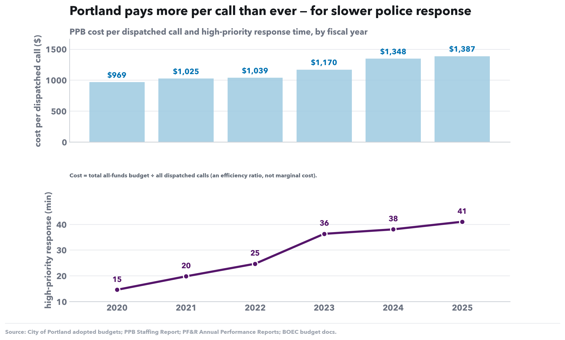
PPB cost per dispatched call and high-priority response time, by fiscal year
What this shows. An efficiency ratio: total PPB budget divided by the number of dispatched calls (blue bars = dollars per call), against p90 response time (purple line). What is the public getting per dollar?
What to look for. Cost per call climbs and response gets slower at the same time — Portland is paying more than ever for worse service. (A budget÷volume ratio, not a true unit cost, but the direction is unambiguous.)
| FY | Cost per call | p90 response (mm:ss) |
|---|---|---|
| 2020 | $969 | 14:32 |
| 2021 | $1,025 | 19:46 |
| 2022 | $1,039 | 24:39 |
| 2023 | $1,170 | 36:17 |
| 2024 | $1,348 | 38:01 |
| 2025 | $1,387 | 40:59 |
| Budget ÷ all dispatched calls (an efficiency ratio, not marginal cost). | ||
Four things to understand to read these charts correctly — written plainly, so they can be paraphrased into a post or a web page.
Response time = the wait in the dispatch queue + the travel to the scene — the clock as the caller feels it, from the moment 911 has your emergency to the moment help is at the door. The queue (waiting for a free unit to be sent) is the part that explodes when staffing is short; travel is the drive. We add them together because that total is what people actually experience — a metric that counts travel only would hide the part of the wait that got worst.
For the public: “Response time is the whole wait — from when 911 has your emergency to when help arrives — not just the drive.”
p90 means 9 of 10 calls are answered faster than this number; 1 in 10 is slower. Two reasons it’s the right yardstick: (a) it’s the national public-safety standard — NFPA 1710, the fire benchmark this comparison is anchored to, is defined as a p90 target (on scene within 5:20 for 90% of high-priority calls), so matching it keeps police and fire like-for-like. (b) the average hides the crisis; p90 exposes it — response times are lopsided: most calls are normal, but a long tail drags out badly, and that tail is the harm we care about. When a system is overwhelmed the tail blows up first, so p90 moves sharply while the average barely twitches. PPB publishes averages, which makes the problem look smaller than it is.
For the public: “We report the 1-in-10 worst wait — that’s the emergency people actually fear, and it’s the national standard fire is graded on.”
If two response charts show different numbers, it’s almost always which calls are counted — not a contradiction. These charts use high-priority calls only (life-safety / urgent); Nick’s chart blends all calls (high + medium + low). We use high-priority because it’s a true emergency-response number — routine calls drag the figure down until it stops looking like emergency response — and because it matches fire, which is also high-priority. Blending in low-priority calls makes the change look less alarming, not because things improved but because routine calls dilute the signal. Our chart axes now say “high-priority” so the two can sit side by side without confusion.
The two bureaus start their stopwatches at different moments: police response includes the dispatch-queue wait; fire’s clock starts later, at unit notification, so it excludes that wait. That alone makes the police number structurally larger. So the honest comparison isn’t a single minutes gap — it’s direction: police response is degrading several times faster than fire’s, and where the same component exists on both sides (travel vs travel) we compare those.
For the public: “We’re not claiming police are exactly N minutes slower than fire — the bureaus time things differently. The story is the direction: police response is getting worse, fast, while fire’s has held.”
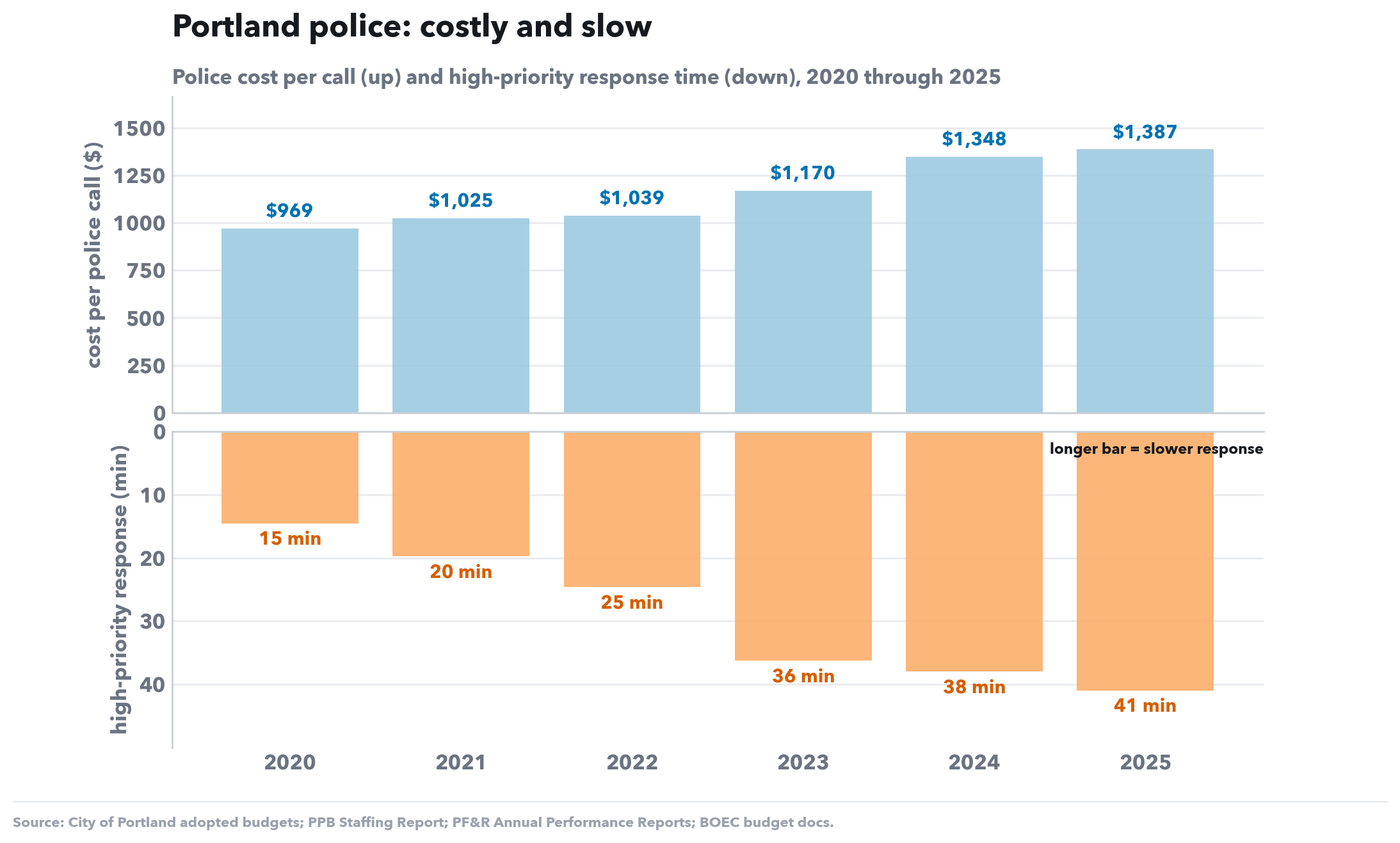
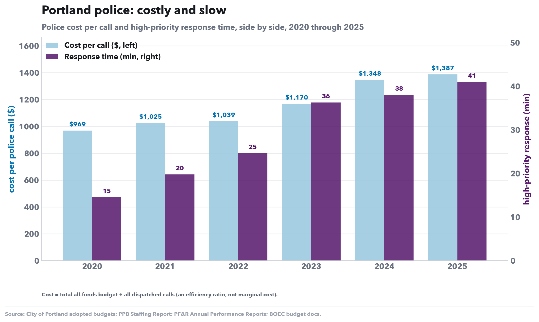
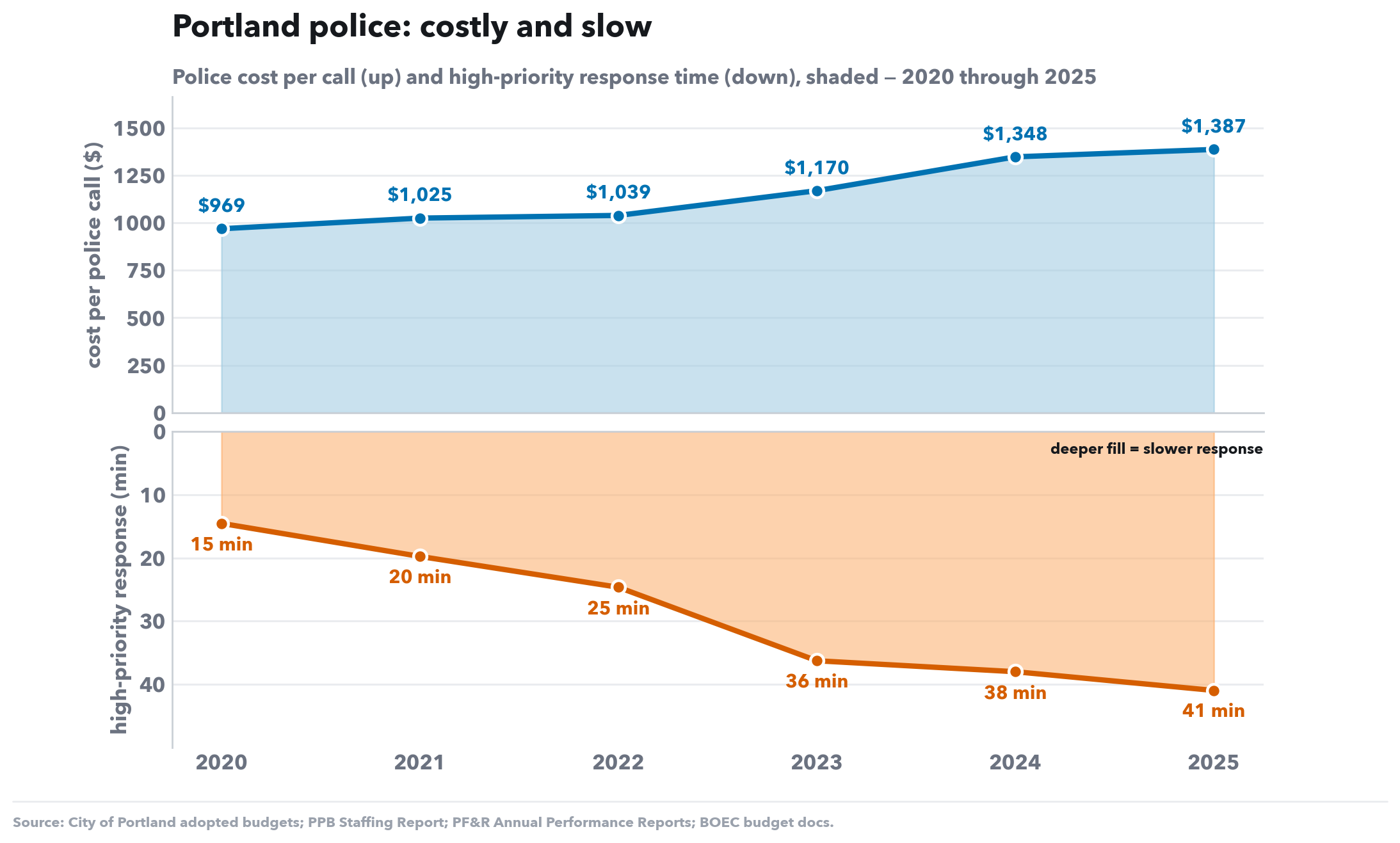
Same data — cost per call $969→$1,387 and high-priority response 15→41 min — drawn three other ways. Cost is zero-based; response is labeled where its axis is truncated.
Police cost per call (up) and high-priority response time (down), 2020 through 2025
Mirror (bars): cost rises above the centre line, response time falls below it — both grow away from centre.
Police cost per call and high-priority response time, side by side, 2020 through 2025
Dual axis with side-by-side labeled bars — no line over the chart.
Police cost per call (up) and high-priority response time (down), shaded — 2020 through 2025
Mirror as shaded areas — the same read as the bar mirror with less ink.
The citywide police numbers above are an average across three precincts that did not fare alike. Police calls carry a location, so they disaggregate geographically (fire data is citywide only, so fire stays a citywide benchmark and is not split here).
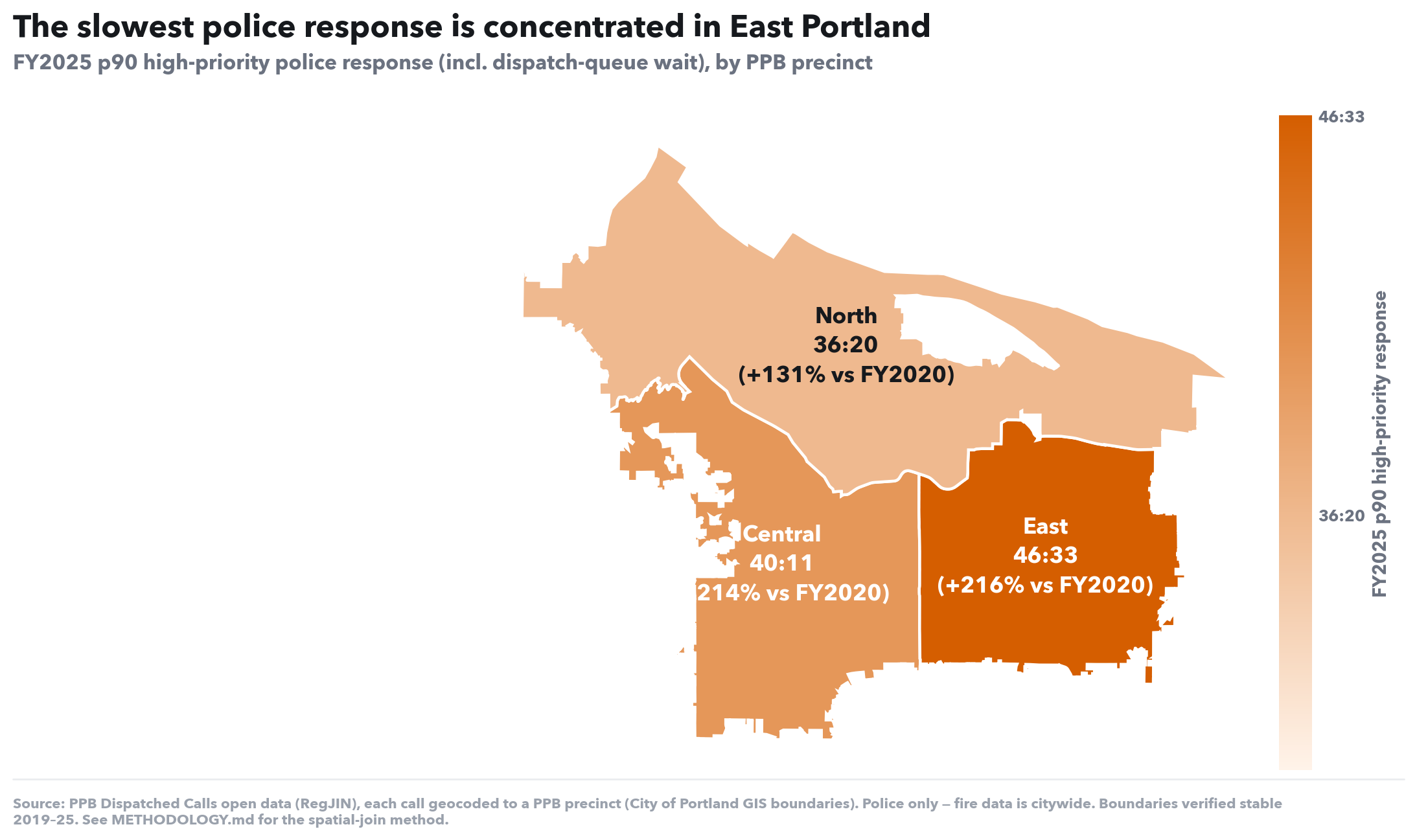
FY2025 p90 high-priority police response (incl. dispatch-queue wait), by PPB precinct
What this shows. The latest (FY2025) p90 high-priority response — the full wait including the dispatch queue — drawn on the city map. Each of PPB's three precincts is shaded by how long a high-priority call waits there now (darker = slower), labeled with that wait and its change since FY2020. Same numbers as the line chart below, placed in space.
What to look for. The map removes any doubt about where the slowdown lands. The deepest shade sits over East Portland — the lower-income, most diverse part of the city. The worst response isn't scattered citywide; it is concentrated in the precinct that was already the slowest to begin with.
| Precinct | FY2025 response | Change since FY2020 |
|---|---|---|
| Central | 40:11 | +214% |
| East | 46:33 | +216% |
| North | 36:20 | +131% |
| The value shading each precinct on the map. Full response incl. dispatch-queue wait; PPB only, boundaries verified stable 2019–25. | ||
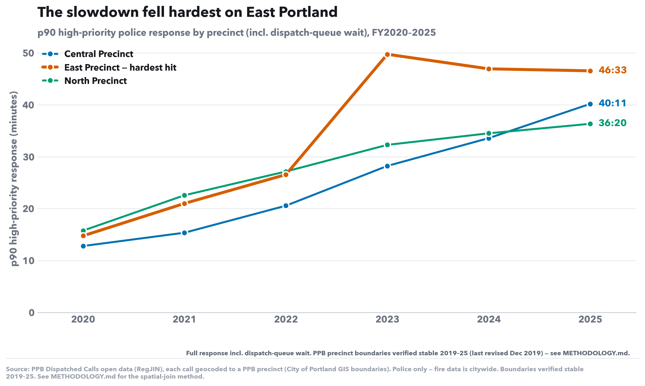
p90 high-priority police response by precinct (incl. dispatch-queue wait), FY2020–2025
What this shows. Police high-priority response — the full wait including the dispatch queue — drawn separately for each of PPB's three precincts. Each call is placed in a precinct by its own latitude/longitude (a spatial join to the current PPB district boundaries); fire stays citywide and is not shown here.
What to look for. The collapse is not evenly spread. East Portland — the lower-income, most diverse precinct — is the slowest in every single year and rose the most in absolute terms. The citywide average hides that the worst-served part of the city got left furthest behind.
| FY | Central | East | North |
|---|---|---|---|
| 2020 | 12:47 | 14:45 | 15:45 |
| 2021 | 15:20 | 20:59 | 22:34 |
| 2022 | 20:33 | 26:33 | 27:09 |
| 2023 | 28:13 | 49:44 | 32:17 |
| 2024 | 33:34 | 46:56 | 34:30 |
| 2025 | 40:11 | 46:33 | 36:20 |
| FY2020→FY2025 change: Central +214%, East +216%, North +131%. Full response incl. dispatch-queue wait. PPB only; boundaries verified stable 2019–25. | |||
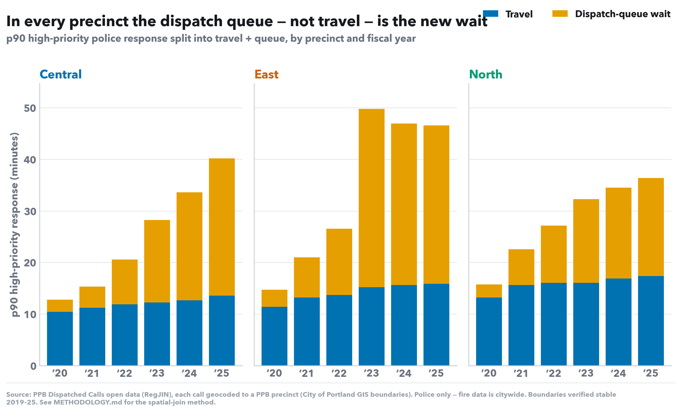
p90 high-priority police response split into travel + queue, by precinct and fiscal year
What this shows. Each precinct's p90 response split into travel (blue, the drive) and dispatch-queue wait (orange, time before any unit is sent). Queue here is the derived penalty (full response minus travel), so each stacked bar sums to that precinct's p90 response.
What to look for. Travel barely moves anywhere — the growth is the orange queue segment in all three precincts, and it is deepest in East. The mechanism is the same citywide (no free car to send), but its weight lands hardest where response was already worst.
| Precinct | Travel | Dispatch-queue wait | Total response |
|---|---|---|---|
| Central | 13:34 | 26:37 | 40:11 |
| East | 15:51 | 30:42 | 46:33 |
| North | 17:23 | 18:57 | 36:20 |
| Queue = full response − travel (a derived penalty; p90 components don't sum). Latest complete fiscal year. | |||
The headline charts above track high-priority calls — the like-for-like match against fire. But the dispatch-queue collapse hit every priority of call. Police calls carry a priority code, so they break out by tier (High = priority 1–3, Medium = 4, Low = 5–9 — what falls in each tier?).
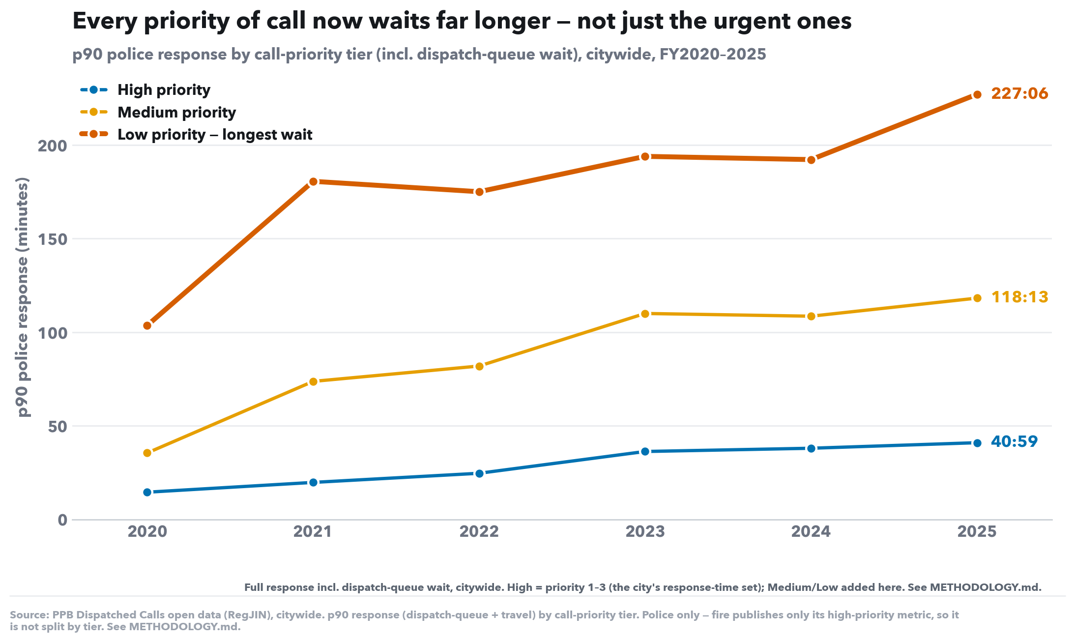
p90 police response by call-priority tier (incl. dispatch-queue wait), citywide, FY2020–2025
What this shows. Police p90 response — the full wait including the dispatch queue — drawn separately for each call-priority tier. High is priority 1–3 (the set the city publishes a response time for); Medium and Low are added here. Fire publishes only its high-priority metric, so it is not split by tier.
What to look for. The collapse is not confined to urgent calls. Every tier climbs steeply, and the lower the priority the longer the absolute wait — a low-priority call now takes the better part of an hour at the 90th percentile. The high-priority line (the one matched against fire) is the floor, not the whole story.
| FY | High | Medium | Low |
|---|---|---|---|
| 2020 | 14:32 | 35:30 | 103:35 |
| 2021 | 19:46 | 73:44 | 180:36 |
| 2022 | 24:39 | 81:55 | 175:03 |
| 2023 | 36:17 | 110:00 | 193:56 |
| 2024 | 38:01 | 108:33 | 192:12 |
| 2025 | 40:59 | 118:13 | 227:06 |
| FY2020→FY2025 change: High +182%, Medium +233%, Low +119%. Full response incl. dispatch-queue wait. PPB only, citywide. High = priority 1–3, Medium = 4, Low = 5–9. | |||
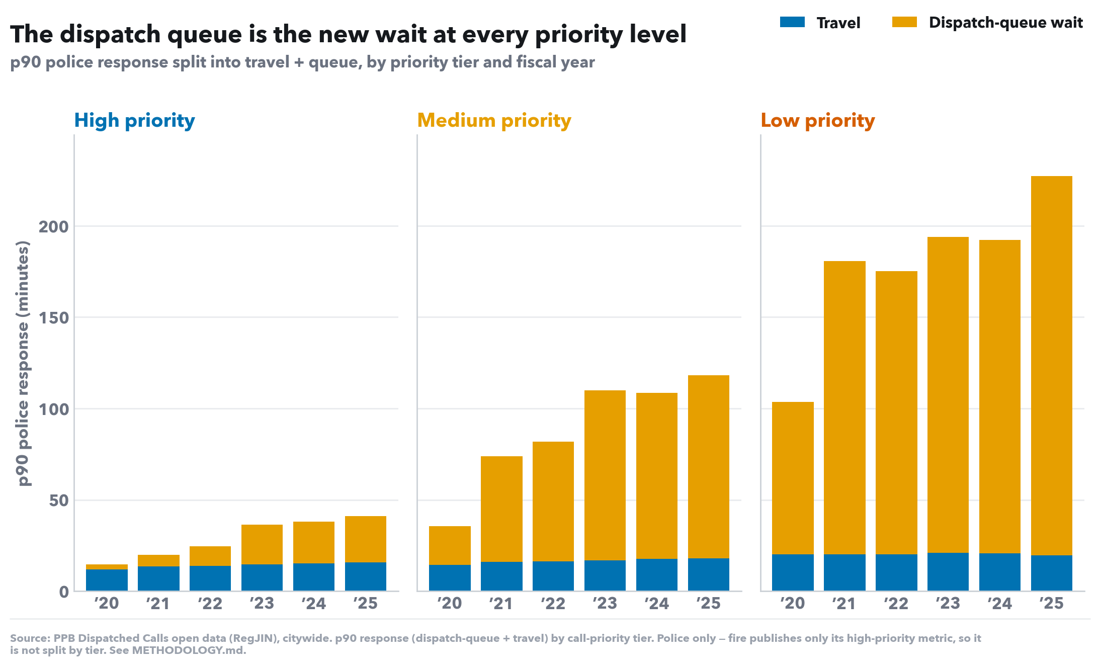
p90 police response split into travel + queue, by priority tier and fiscal year
What this shows. Each tier's p90 response split into travel (blue, the drive) and dispatch-queue wait (orange, time before any unit is sent). Queue here is the derived penalty (full response minus travel), so each stacked bar sums to that tier's p90 response.
What to look for. Travel barely moves at any priority — the growth is the orange queue segment across all three tiers. The same mechanism (no free car to send) drives the delay whether the call is urgent or not.
| Tier | Travel | Dispatch-queue wait | Total response |
|---|---|---|---|
| High priority | 15:42 | 25:17 | 40:59 |
| Medium priority | 17:54 | 100:19 | 118:13 |
| Low priority | 19:35 | 207:31 | 227:06 |
| Queue = full response − travel (a derived penalty; p90 components don't sum). Latest complete fiscal year. | |||
Everything above is reactive — 911-dispatched calls. This section adds the proactive half: officer-initiated stops (Oregon STOP Act data). They are a separate clock and are never blended with dispatched calls. Inspired by the 2022 Catalyst California finding that police spend most proactive time on traffic, not violent crime — with the honest caveat that Oregon records no stop duration, so these are stop counts and shares, not officer-hours.
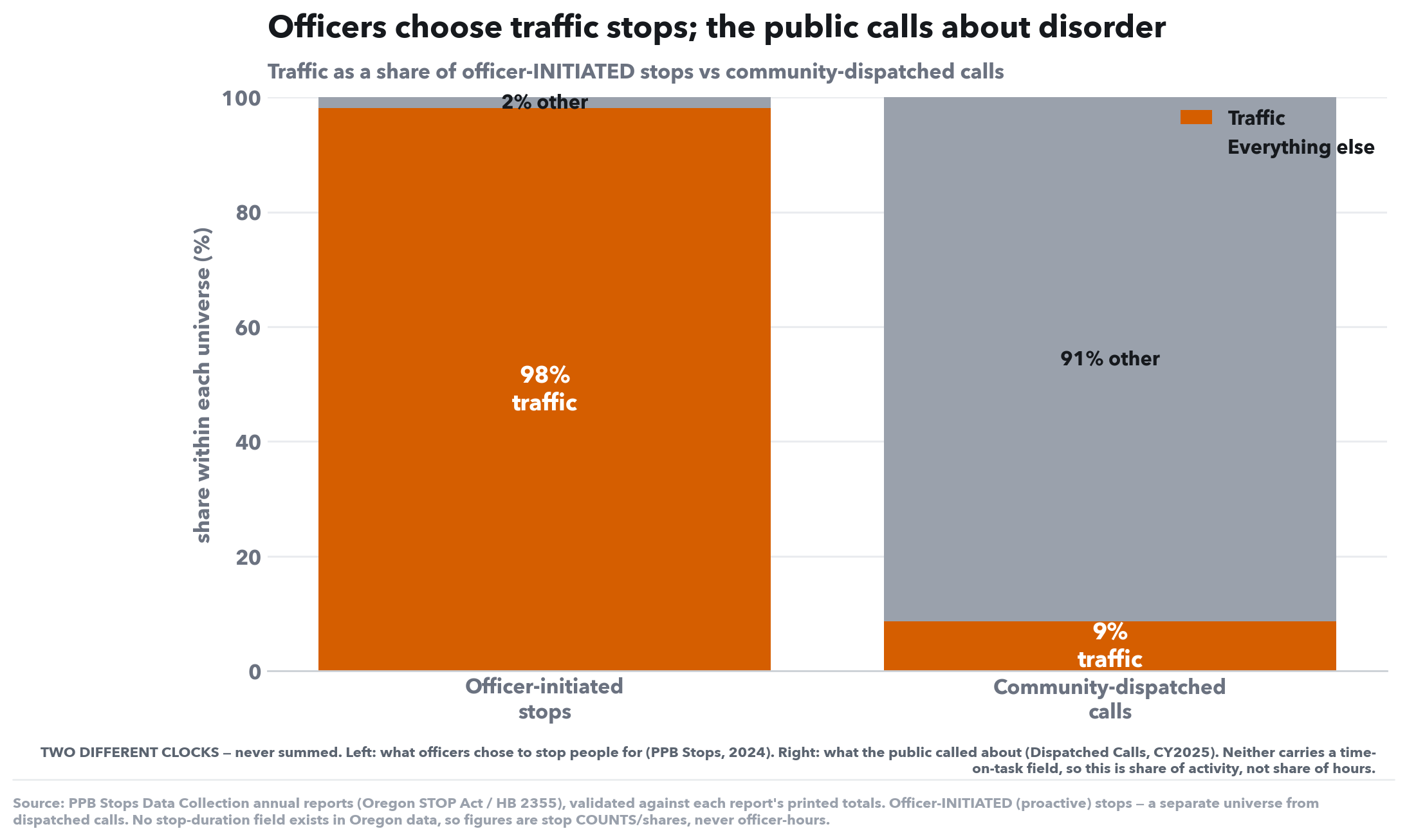
Traffic as a share of officer-INITIATED stops vs community-dispatched calls
What this shows. Two side-by-side bars, each adding to 100% within its own universe: what officers chose to stop people for (left, PPB Stops 2024) vs what the public called about (right, Dispatched Calls). The bars are never summed — they have different denominators and different clocks.
What to look for. Nearly all proactive stops — ~98% — cite only a traffic offense, while traffic is under a tenth of what the community dispatches police to. This is the Portland echo of the Catalyst California finding: officer-initiated police effort flows overwhelmingly to traffic enforcement, not to the violent crime the public most associates with policing.
| Universe | Traffic | Everything else |
|---|---|---|
| Officer-initiated stops (proactive) | 98.1% | 1.9% |
| Community-dispatched calls (reactive) | 8.7% | 91.3% |
| Stops: PPB Stops Data Collection 2024 (traffic-offense-only vs other-crime). Calls: PPB Dispatched Calls CY2025 (FinalCallGroup). Different denominators, different clocks; neither is time-on-task. | ||
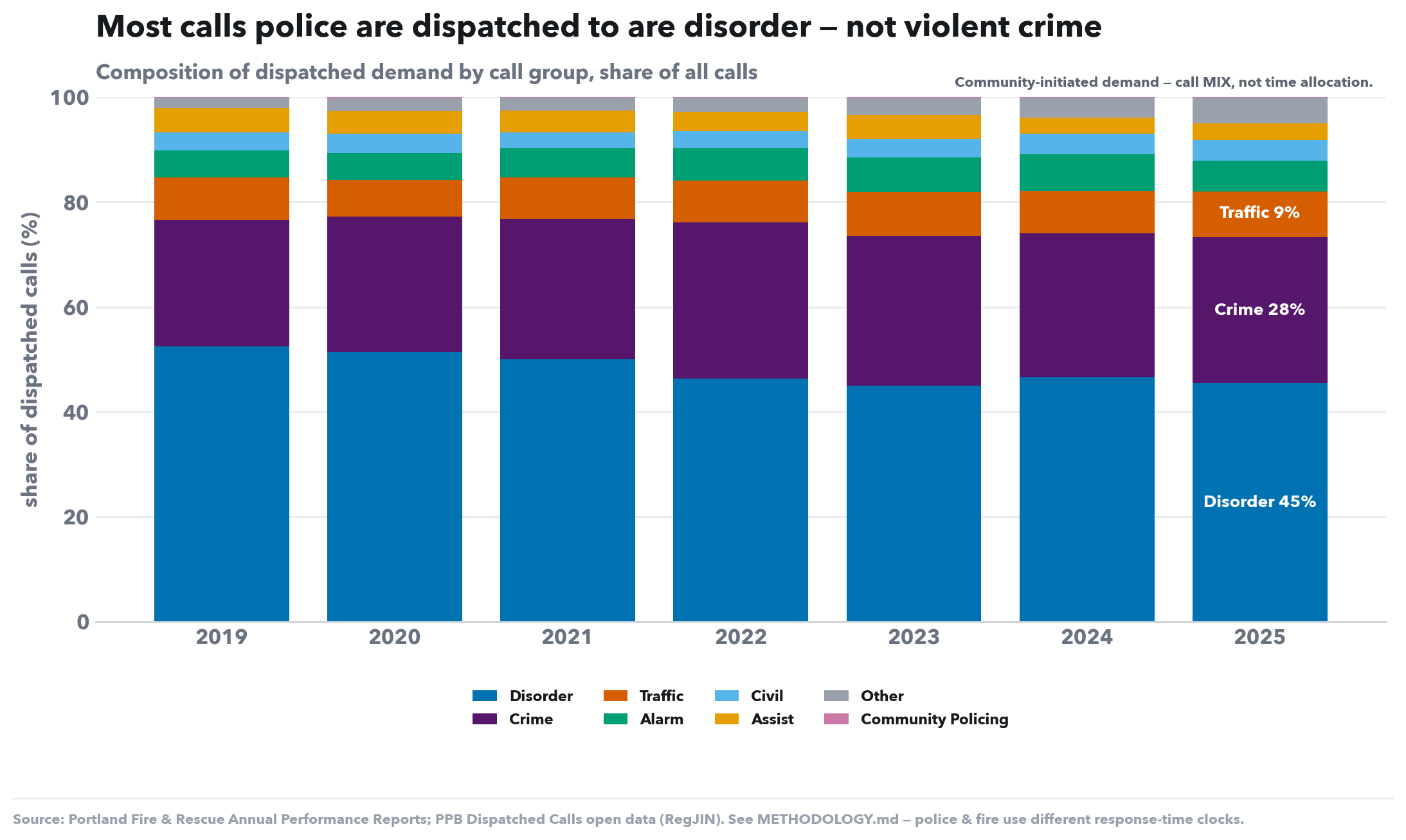
Composition of dispatched demand by call group, share of all calls
What this shows. The composition of dispatched demand — community-initiated 911/non-emergency calls — by call group, as a share of all calls per year. This is the reactive universe: what Portlanders call police about.
What to look for. Disorder/quality-of-life calls are the largest bucket (~46%), with Crime next; Traffic is a small slice (~8%). This is call mix, not time on task (the data carries no time-on-scene field) — so it shows what police are asked to handle, which is mostly not violent crime.
| Call group | Calls | Share |
|---|---|---|
| Disorder | 94,935 | 45.5% |
| Crime | 58,231 | 27.9% |
| Traffic | 18,104 | 8.7% |
| Alarm | 12,124 | 5.8% |
| Other | 10,219 | 4.9% |
| Civil | 8,349 | 4.0% |
| Assist | 6,545 | 3.1% |
| Community Policing | 233 | 0.1% |
| Community-initiated dispatched demand (call mix, not time allocation). FinalCallGroup field, PPB Dispatched Calls open data. | ||
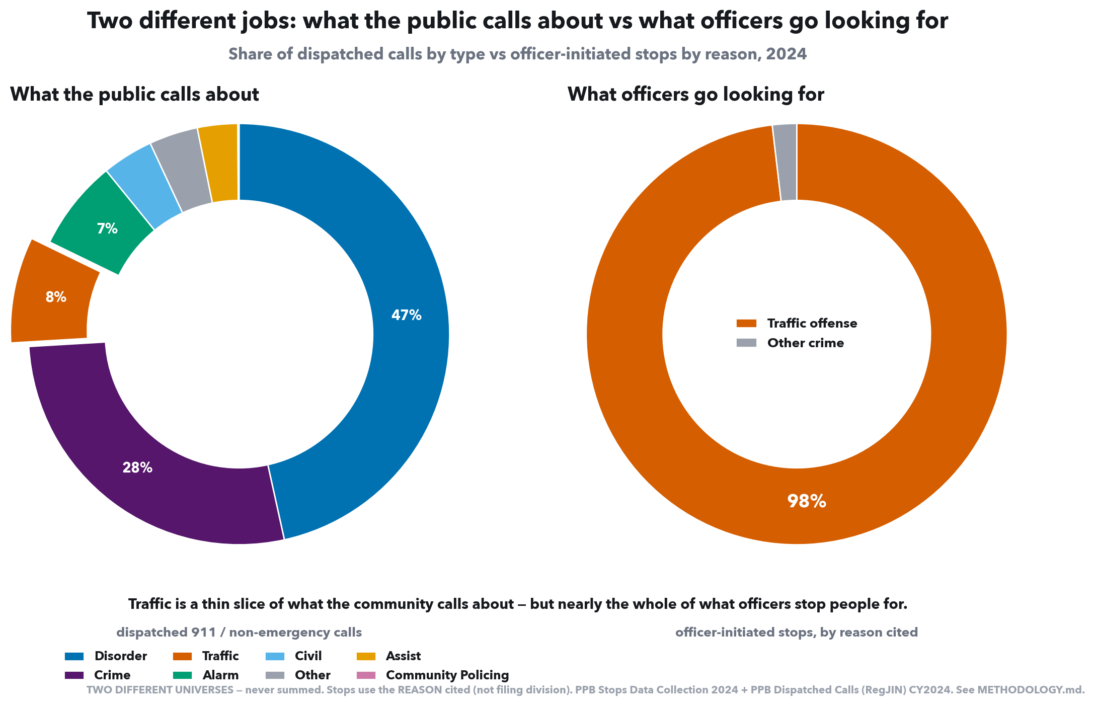
Share of dispatched calls by type vs officer-initiated stops by reason, 2024
What this shows. The two universes side by side, as a single 2024 snapshot: the full category mix of dispatched calls (left) against officer-initiated stops by reason cited (right). Traffic is the same colour in both, so the eye carries from the thin call slice to the near-whole stop circle. Two different denominators — never summed.
What to look for. What the public calls about is diverse — disorder 47%, crime 28%, traffic only ~8%. What officers initiate is monolithic — ~98% of stops cite a traffic offense. The same Traffic wedge that is a sliver of community demand is essentially the entire proactive workload.
| Category | Count | Share of its universe |
|---|---|---|
| What the public calls about (dispatched) | — | |
| Disorder | 92,473 | 46.5% |
| Crime | 54,667 | 27.5% |
| Traffic | 16,172 | 8.1% |
| Alarm | 13,788 | 6.9% |
| Civil | 7,804 | 3.9% |
| Other | 7,445 | 3.7% |
| Assist | 6,145 | 3.1% |
| Community Policing | 178 | 0.1% |
| What officers initiate (stops, by reason) | — | |
| Traffic offense | 23,717 | 98.1% |
| Other crime | 450 | 1.9% |
| Two separate universes, never summed. Calls: PPB Dispatched Calls (RegJIN) CY2024, FinalCallGroup. Stops: PPB Stops Data Collection 2024, REASON cited (traffic-offense-only vs other-crime) — not filing division. | ||
Two plain questions behind the response-time story. First, is demand rising? No — total dispatched volume is flat-to-down. Second, where is the staffing going? A standing share of overtime exists purely to backfill absent officers — the closest public proxy for absenteeism, since Oregon publishes no per-officer sick-leave series. Together: the slowdowns land against falling calls and a force too thin to cover its own shifts.
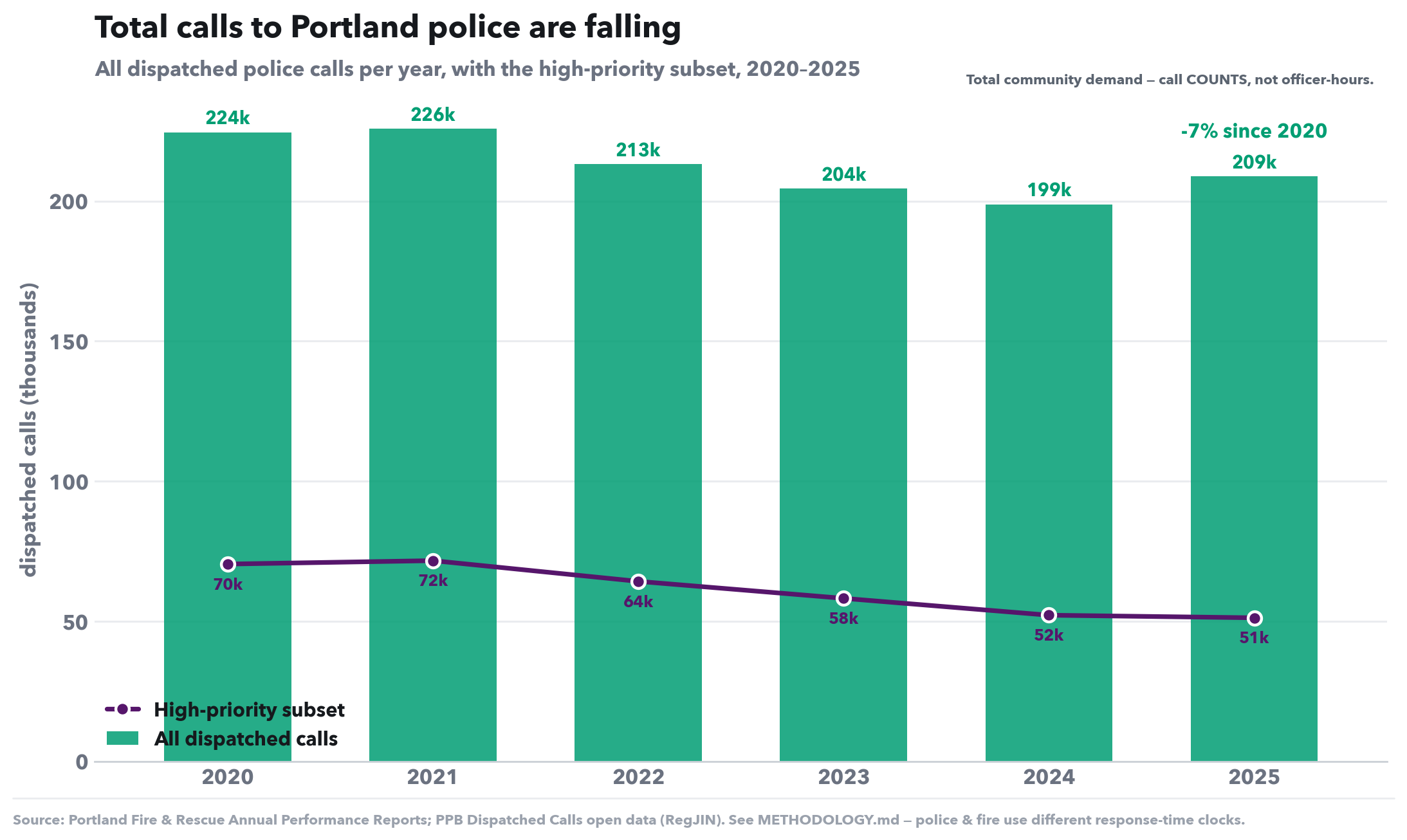
All dispatched police calls per year, with the high-priority subset, 2020–2025
What this shows. Total dispatched police demand per calendar year, 2020–2025 — every 911/non-emergency call PPB was sent to (green bars), with the high-priority subset broken out (purple line). This is the reactive universe — what the community calls police about — counted, not weighted by time on scene.
What to look for. Demand is flat-to-down: total calls slip from ~224k to ~209k (−7%), and the high-priority subset falls harder, ~70k→51k (−27%). So the rising response times elsewhere in this report are not a story of surging demand — calls went down while waits went up, which points back at staffing, not call volume.
| CY | All calls | High-priority | Δ vs 2020 |
|---|---|---|---|
| 2020 | 224,484 | 70,389 | +0.0% |
| 2021 | 225,740 | 71,611 | +0.6% |
| 2022 | 213,128 | 64,211 | -5.1% |
| 2023 | 204,402 | 58,150 | -8.9% |
| 2024 | 198,672 | 52,137 | -11.5% |
| 2025 | 208,742 | 51,207 | -7.0% |
| 2020→2025. PPB Dispatched Calls open data (RegJIN). Call COUNTS — community-initiated demand, not officer-hours or time on task. | |||
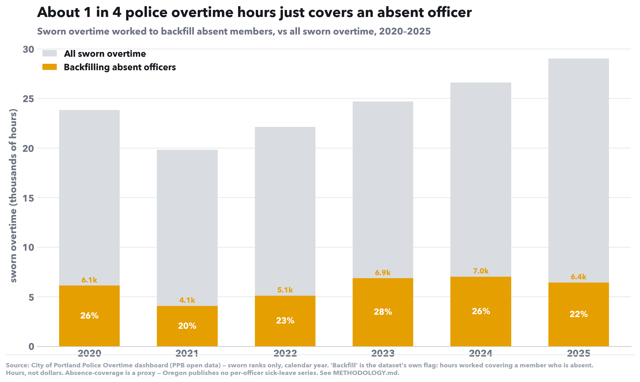
Sworn overtime worked to backfill absent members, vs all sworn overtime, 2020–2025
What this shows. How much overtime exists purely to cover absent officers. Each bar is all sworn overtime for the year (grey); the orange chunk is the City overtime dashboard's own “Backfill” flag — “working a shift for a member who is absent.” Oregon publishes no per-officer sick-leave series, so backfill overtime is the closest measurable absenteeism proxy — it counts the hours absence forces onto someone else.
What to look for. Backfill is a steady ~22–28% of all sworn overtime — about one in four OT hours just covers an absent colleague — and the absolute burden climbed from ~4.1k hours (2021) to ~7.0k (2024). Whatever the cause of the absences, the bureau is paying overtime to cover open shifts rather than leaving them empty, year after year.
| CY | All sworn OT | Backfill (absent-cover) | Backfill share |
|---|---|---|---|
| 2020 | 23,837 | 6,110 | 25.6% |
| 2021 | 19,820 | 4,071 | 20.5% |
| 2022 | 22,129 | 5,099 | 23.0% |
| 2023 | 24,675 | 6,856 | 27.8% |
| 2024 | 26,618 | 7,017 | 26.4% |
| 2025 | 29,013 | 6,427 | 22.2% |
| 2020→2025. City of Portland Police Overtime dashboard (PPB open data), sworn ranks only. 'Backfill' = the dataset's own flag for working a shift for an absent member. Work Hours (actual), not pay-multiplied. | |||
Post-ready cuts of the charts above: one idea each, a plain title baked in, and the caveats written on the image so they stand alone on social. Same data as the report — just framed for sharing.
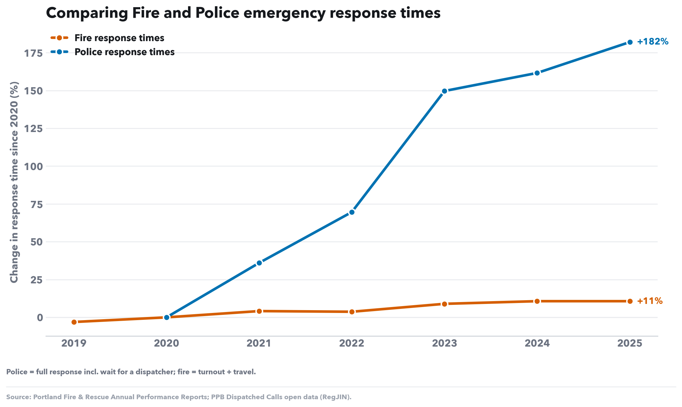
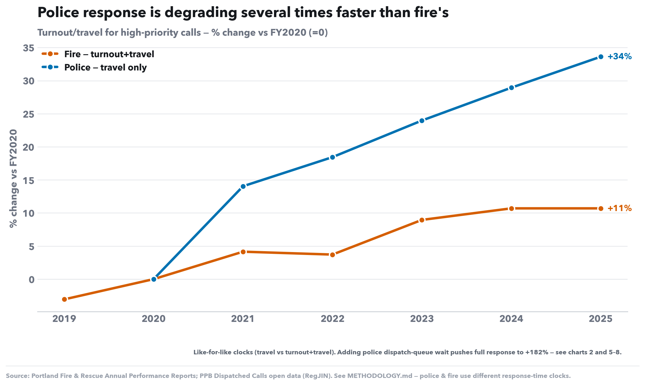
Police vs fire response, one plain line each — the headline +182% police figure with the two-clocks caveat spelled out for a general audience.
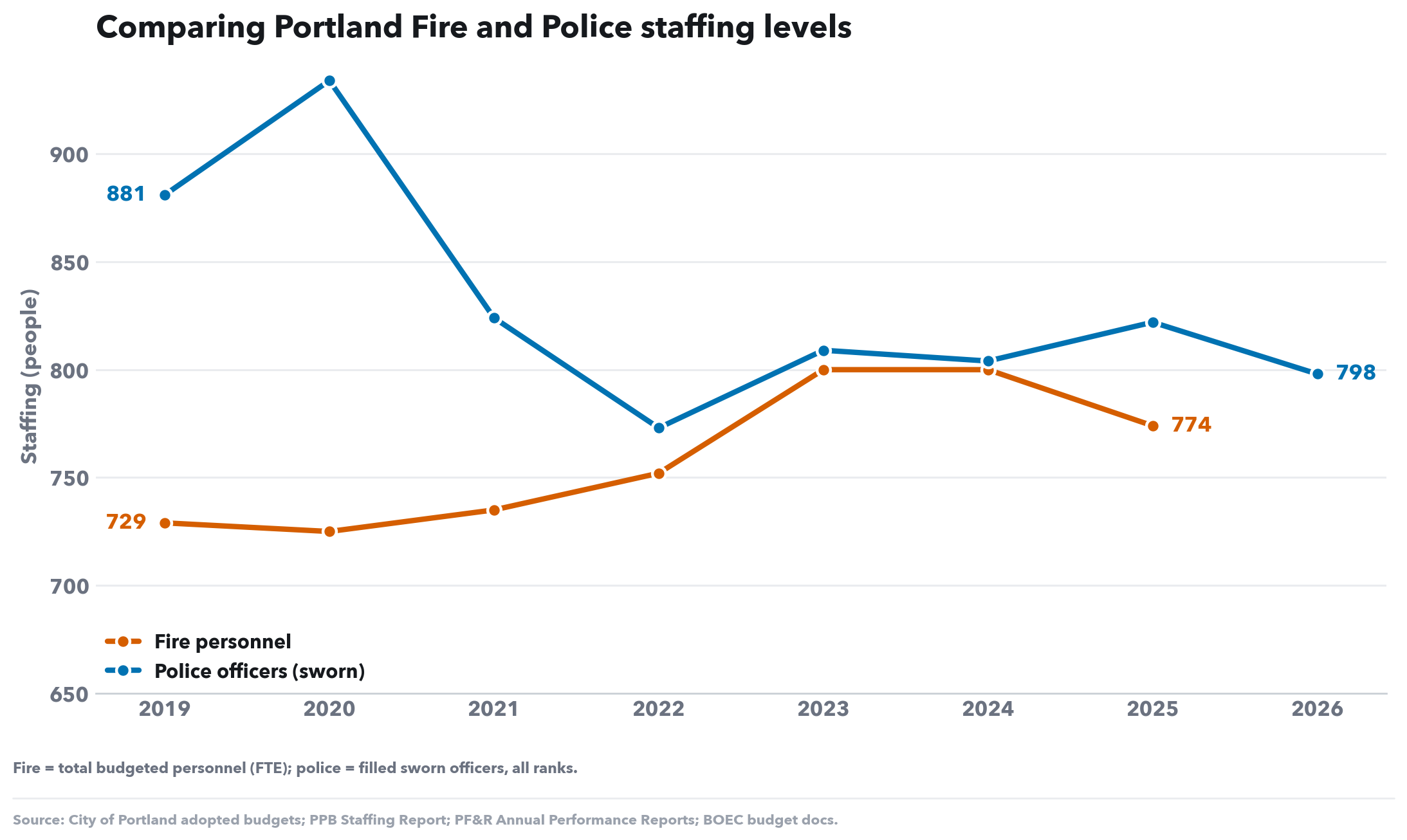
Fire vs police staffing on one chart — fire grew, police shrank — sized and labelled for a social card.
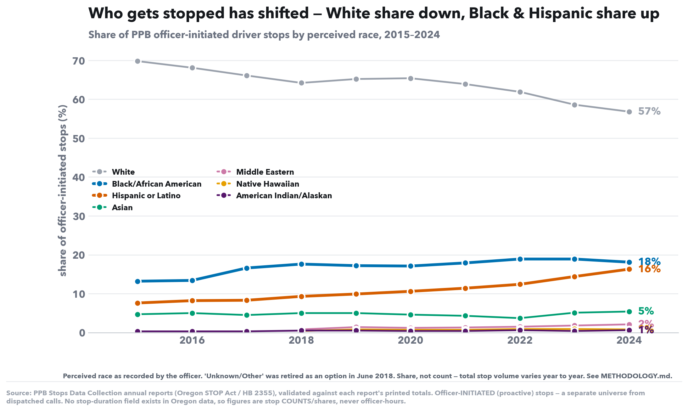
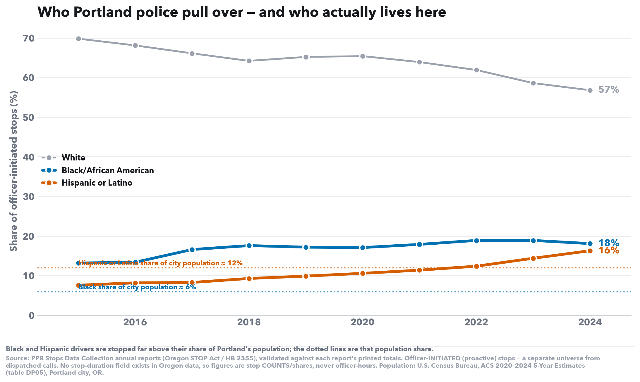
The racial-disparity trend with dotted city-population reference lines, so the over-representation of Black & Hispanic drivers reads at a glance.
This report asserts nothing it can’t show you. Every dataset below is the City of Portland’s own published record (or the U.S. Census) — click through to check any number yourself. Charts that combine or re-cut these (e.g. the dispatch-queue split, or the overtime “Backfill” proxy) describe exactly how in each chart’s caption and the methodology notes.
The complete 10-chart analysis behind the chart above. Collapsed for review; expand for the full evidence base.
PPB is asking for a bigger budget. The data says money isn’t the binding constraint — staffing is, and staffing has not followed the dollars.
Turnout/travel for high-priority calls — % change vs FY2020 (=0)
What this shows. The like-for-like comparison: fire (turnout+travel) vs police travel-only — the components that measure each bureau actually getting to the scene. Because the bureaus run on different clocks, each line is shown as % change from FY2020 (=0%); a rate of change is comparable across bureaus even when absolute minutes aren't.
What to look for. Even on travel alone, police degrades faster than fire (+34% vs +11% by FY2025). Police full response — which adds the dispatch-queue wait — climbs to +182%; that staffing-driven blow-up is broken out in chart 2 and charts 5–8. Absolute minutes are in the table below.
| FY | Fire (turnout+travel) | Police (travel only) | Police (full, incl. queue) |
|---|---|---|---|
| 2019 | 7:24 | — | — |
| 2020 | 7:38 | 11:45 | 14:32 |
| 2021 | 7:57 | 13:24 | 19:46 |
| 2022 | 7:55 | 13:55 | 24:39 |
| 2023 | 8:19 | 14:34 | 36:17 |
| 2024 | 8:27 | 15:09 | 38:01 |
| 2025 | 8:27 | 15:42 | 40:59 |
| FY2020→FY2025 change: fire +11%, police travel +34%, police full response +182%. | |||
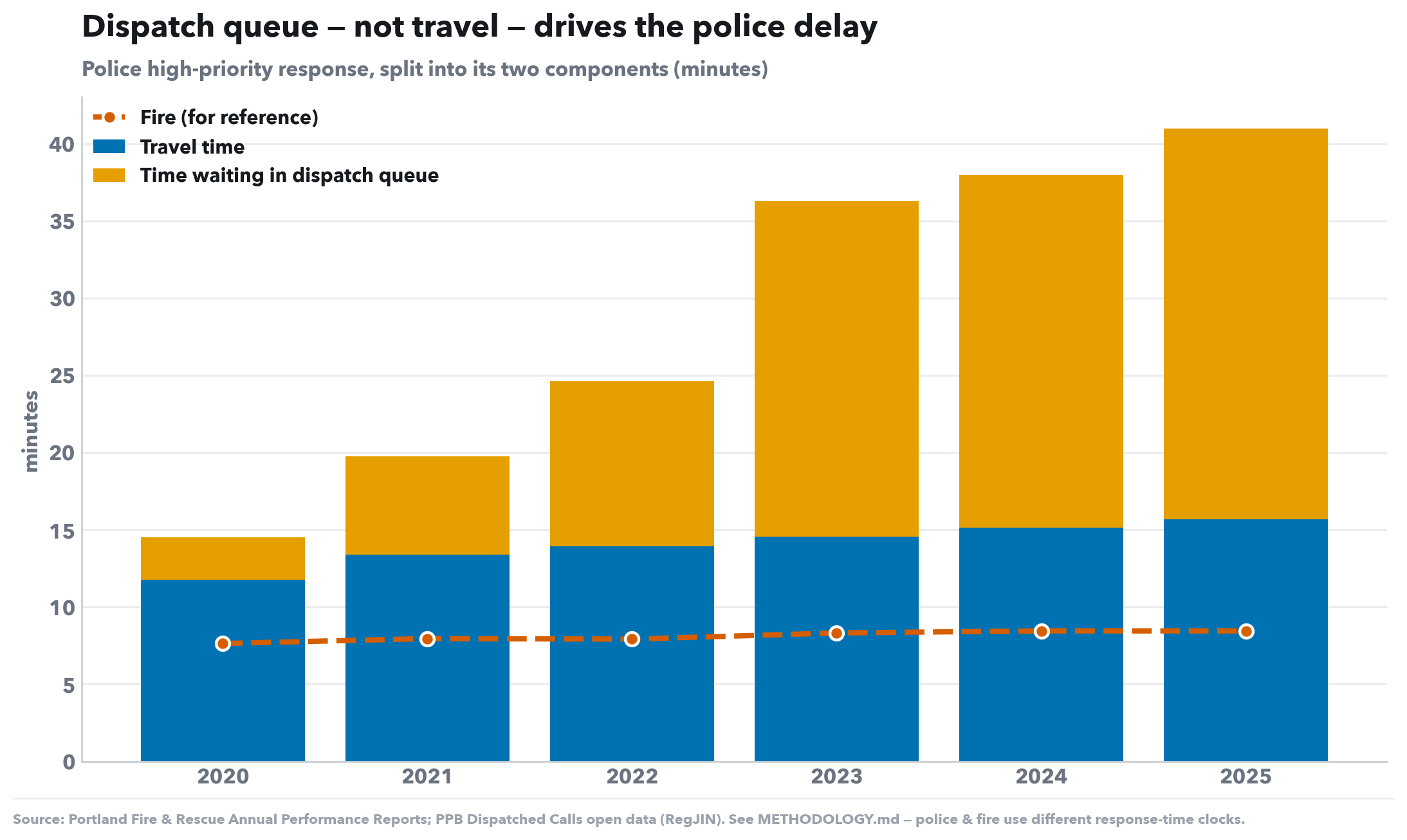
Police high-priority response, split into its two components (minutes)
What this shows. The police high-priority response time, split into its two parts: the blue bar is actual travel time; the orange bar stacked on top is time waiting in the dispatch queue. The dashed line is fire, for scale.
What to look for. The orange (queue) segment grows from a sliver into the majority of the bar. The slowdown isn't cars driving slower — it's calls waiting longer for any car to be free, which points at officer availability, not traffic.
| FY | Travel | Dispatch-queue wait | Total response | Fire (ref) |
|---|---|---|---|---|
| 2020 | 11:45 | 2:47 | 14:32 | 7:38 |
| 2021 | 13:24 | 6:22 | 19:46 | 7:57 |
| 2022 | 13:55 | 10:44 | 24:39 | 7:55 |
| 2023 | 14:34 | 21:43 | 36:17 | 8:19 |
| 2024 | 15:09 | 22:52 | 38:01 | 8:27 |
| 2025 | 15:42 | 25:17 | 40:59 | 8:27 |
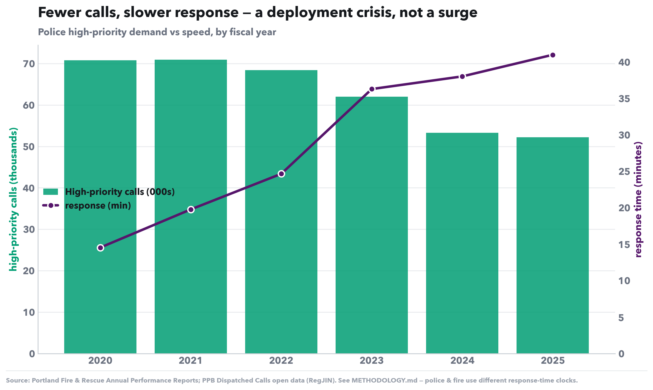
Police high-priority demand vs speed, by fiscal year
What this shows. Two things on one chart for police: green bars are the number of high-priority calls; the purple line is how slow p90 response got. If rising demand were the cause, bars and line would climb together.
What to look for. They move in opposite directions — calls fall while response times rise. Fewer calls but slower service is the signature of a capacity / staffing problem, not a demand surge.
| FY | High-priority calls | p90 response (mm:ss) |
|---|---|---|
| 2020 | 70,770 | 14:32 |
| 2021 | 70,909 | 19:46 |
| 2022 | 68,417 | 24:39 |
| 2023 | 61,979 | 36:17 |
| 2024 | 53,295 | 38:01 |
| 2025 | 52,212 | 40:59 |
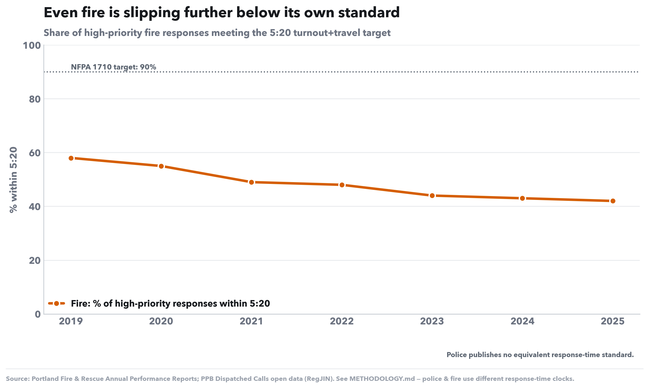
Share of high-priority fire responses meeting the 5:20 turnout+travel target
What this shows. The share of high-priority fire responses that arrive within the 5:20 benchmark. The dotted line is the NFPA 1710 national target of meeting that standard 90% of the time.
What to look for. Even fire — the better-performing bureau — is drifting below its own target and trending down. It's still far ahead of police, but the direction is the wrong way for everyone.
| FY | % within 5:20 |
|---|---|
| 2019 | 58% |
| 2020 | 55% |
| 2021 | 49% |
| 2022 | 48% |
| 2023 | 44% |
| 2024 | 43% |
| 2025 | 42% |
| NFPA 1710 target: 90%. Police publishes no equivalent standard. | |
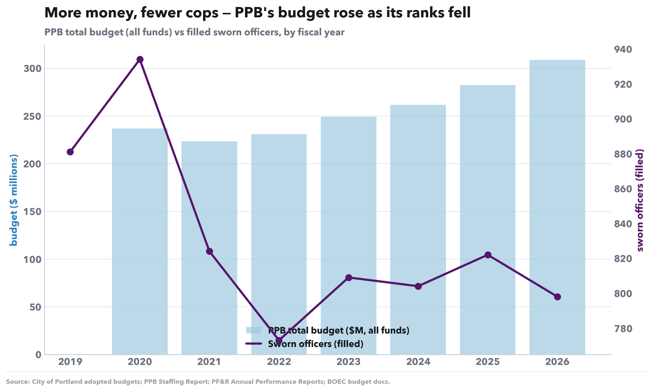
PPB total budget (all funds) vs filled sworn officers, by fiscal year
What this shows. PPB's total budget, all funds (blue bars) against the number of filled sworn officers (purple line). “Sworn” = badge-carrying police, as opposed to civilian staff.
What to look for. The money line climbs from ~$237M to ~$308M while officers fell from a 2020 peak of 934 into the high-700s — more dollars are buying fewer cops on the street. That undercuts the claim that a bigger budget is what produces more policing capacity.
| FY | Budget (all funds) | Filled sworn |
|---|---|---|
| 2019 | — | 881 |
| 2020 | $236.8M | 934 |
| 2021 | $223.3M | 824 |
| 2022 | $230.9M | 773 |
| 2023 | $249.0M | 809 |
| 2024 | $261.7M | 804 |
| 2025 | $282.4M | 822 |
| 2026 | $308.5M | 798 |
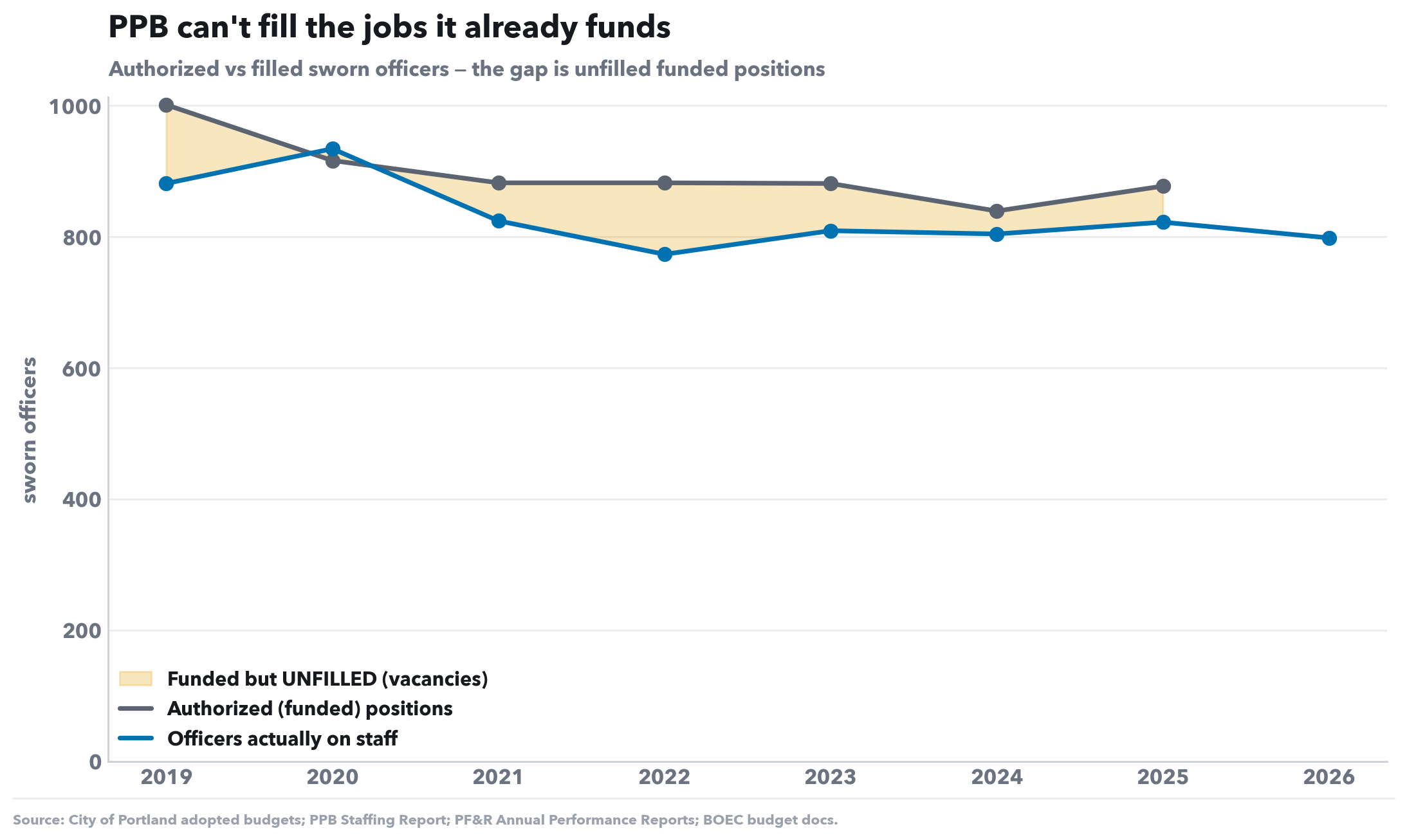
Authorized vs filled sworn officers — the gap is unfilled funded positions
What this shows. Two officer counts: authorized (positions the budget already funds) and filled (officers actually on staff). The shaded band between them is unfilled funded positions — jobs the city is paying for but can't fill.
What to look for. The shaded gap persists and widens. PPB isn't blocked by a lack of funding — it can't hire and retain up to the headcount it's already funded for. More budget can't fix a hiring problem.
| FY | Authorized (funded) | Filled | Unfilled gap |
|---|---|---|---|
| 2019 | 1,001 | 881 | 120 |
| 2020 | 916 | 934 | -18 |
| 2021 | 882 | 824 | 58 |
| 2022 | 882 | 773 | 109 |
| 2023 | 881 | 809 | 72 |
| 2024 | 839 | 804 | 35 |
| 2025 | 877 | 822 | 55 |
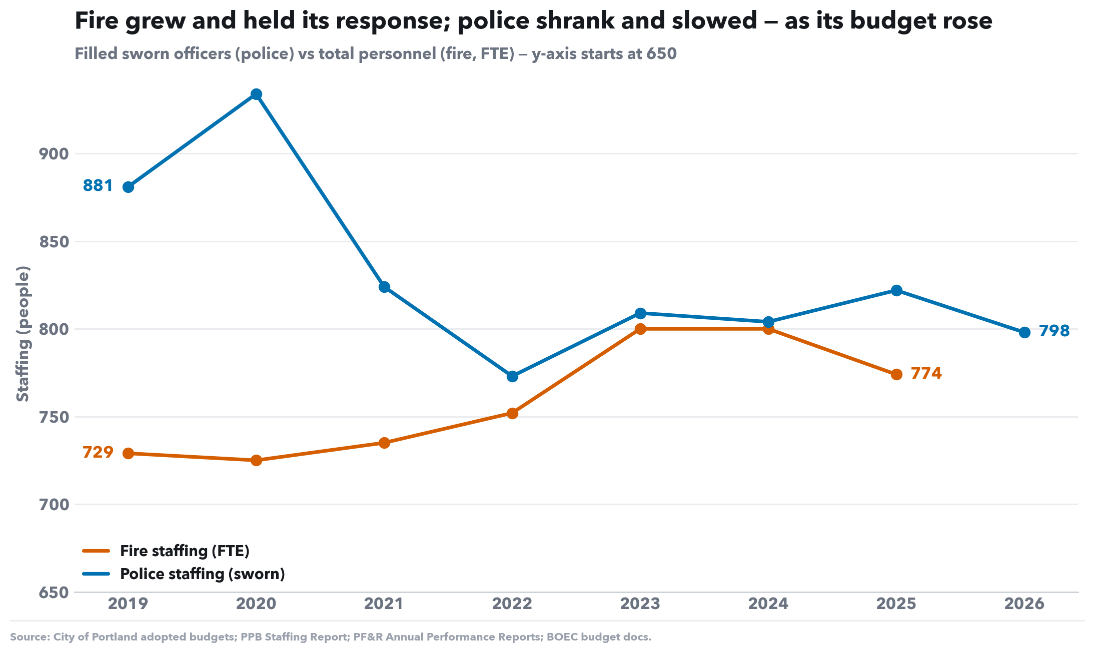
Filled sworn officers (police) vs total personnel (fire, FTE) — y-axis starts at 650
What this shows. Both bureaus' staffing in absolute headcount — police filled sworn officers and total fire personnel (FTE). The y-axis starts at 650 (not zero) so the year-to-year movement is legible; the values are real counts, not an index.
What to look for. Police peaked at 934 sworn in FY2020, shed ~160 officers by FY2022 after the 2020 budget cuts and the wave of departures, and never recovered — even as its budget kept climbing. Fire, by contrast, grew its ranks and held its response. Staffing, not budget, is what tracks with service.
| FY | Fire FTE | Police sworn | Fire index | Police index |
|---|---|---|---|---|
| 2019 | 729 | 881 | 100 | 100 |
| 2020 | 725 | 934 | 99 | 106 |
| 2021 | 735 | 824 | 101 | 94 |
| 2022 | 752 | 773 | 103 | 88 |
| 2023 | 800 | 809 | 110 | 92 |
| 2024 | 800 | 804 | 110 | 91 |
| 2025 | 774 | 822 | 106 | 93 |
| 2026 | — | 798 | — | 91 |
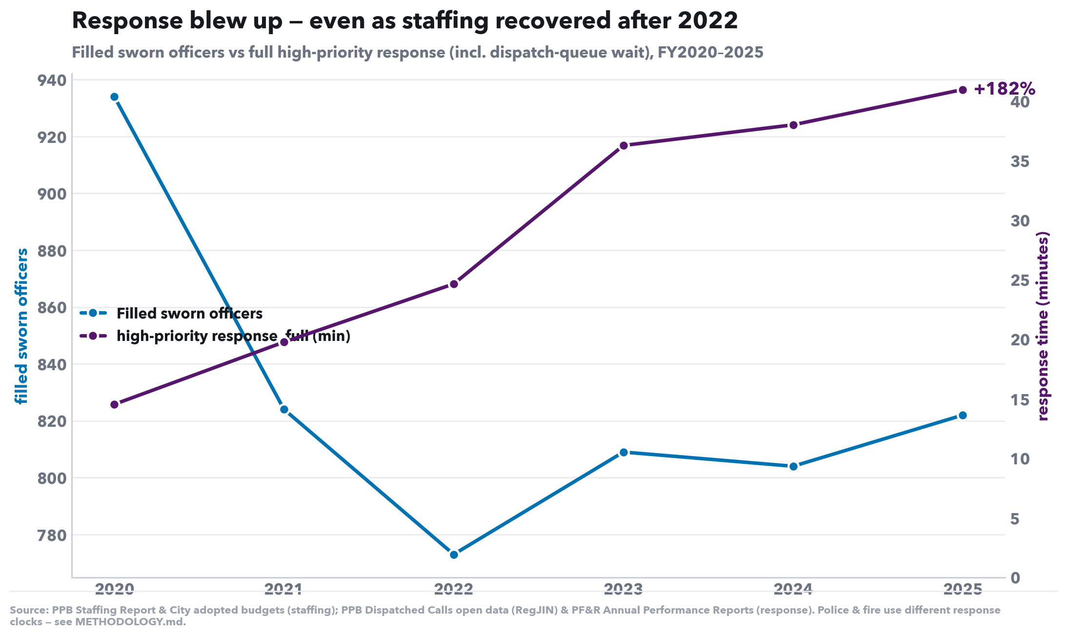
Filled sworn officers vs full high-priority response (incl. dispatch-queue wait), FY2020–2025
What this shows. Police filled sworn officers (blue, left axis) against p90 full response time including the dispatch-queue wait (purple, right axis), FY2020–2025. The response axis is zero-based; each line is read by its direction.
What to look for. The lines open like scissors: as officers fall, response time climbs — full p90 response is up +182% across the window. Fewer officers, dramatically slower service.
| FY | Filled sworn | p90 response, full (mm:ss) |
|---|---|---|
| 2020 | 934 | 14:32 |
| 2021 | 824 | 19:46 |
| 2022 | 773 | 24:39 |
| 2023 | 809 | 36:17 |
| 2024 | 804 | 38:01 |
| 2025 | 822 | 40:59 |
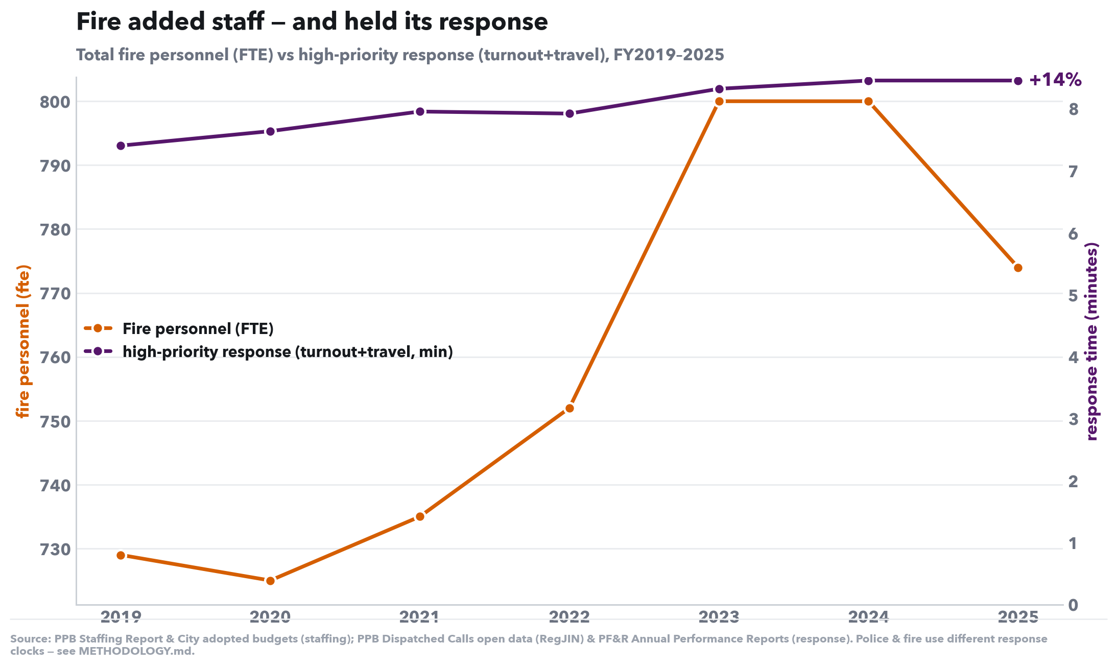
Total fire personnel (FTE) vs high-priority response (turnout+travel), FY2019–2025
What this shows. The same pairing for fire: total personnel in FTE (vermillion, left axis) against p90 response — turnout+travel (purple, right axis). The response axis is zero-based, so the line's near-flatness is honest, not a scaling trick.
What to look for. Fire grew its staffing and its response held — up just +14% over six years, a fraction of police's blow-up. The contrast is the whole argument: staffing tracks service.
| FY | Fire FTE | p90 response (mm:ss) |
|---|---|---|
| 2019 | 729 | 7:24 |
| 2020 | 725 | 7:38 |
| 2021 | 735 | 7:57 |
| 2022 | 752 | 7:55 |
| 2023 | 800 | 8:19 |
| 2024 | 800 | 8:27 |
| 2025 | 774 | 8:27 |